Healthcare For All
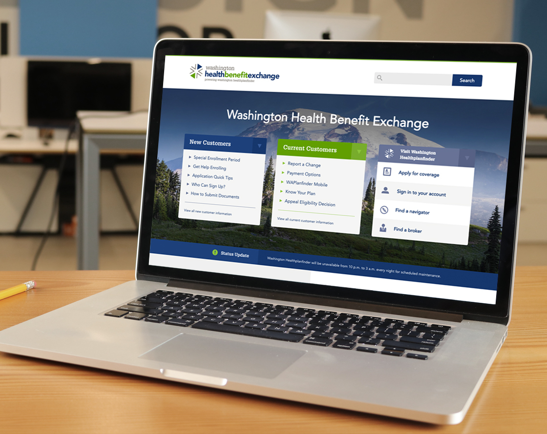
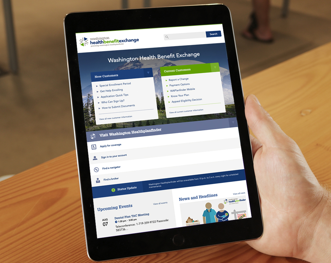
During the redesign of Washington Health Benefit Exchange’s website, user research and usability analysis were conducted to assess how efficiently users could find the information they were seeking. Our goal was to uncover a design strategy for creating an efficient and pleasant user experience. A key component to this project was making the website responsive to mobile devices.
Project / Client Goals
- Organize a transparent and accountable insurance market to better facilitate consumer choice.
- Transfer content to a new, user-friendly content management system and provide a redesigned, responsive look.
- Structure content better and conduct user testing to identify consumer goals and challenges.
Research Strategy & Findings
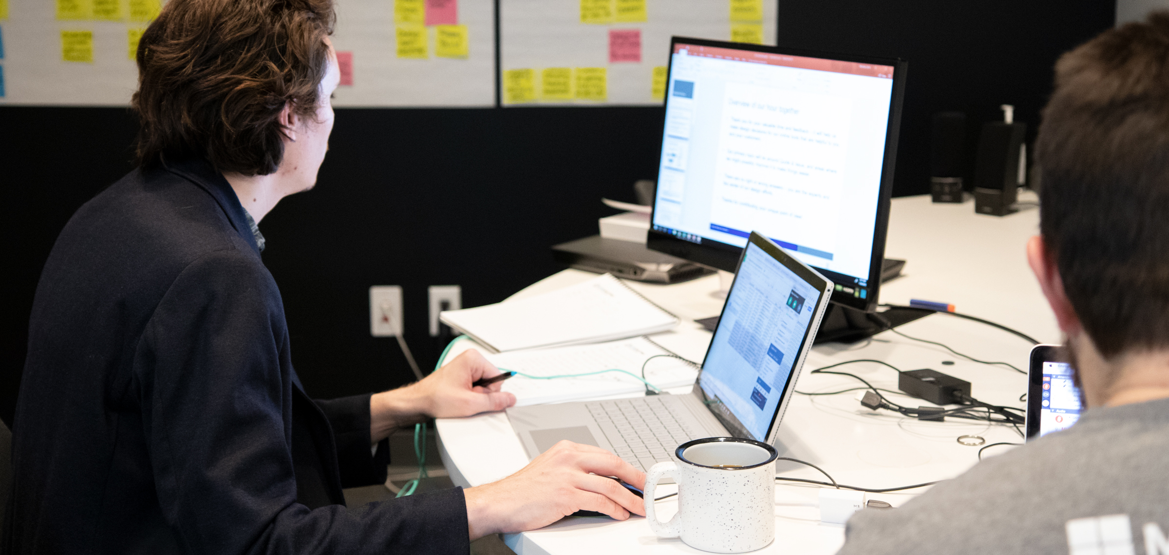
To begin the research phase we first met with stakeholders to identify their business goals for the website, the ultimate mission being to align stakeholder objectives with those of the users. After receiving stakeholder support for conducting a series research studies with their users, we began the process of understanding what customers needed on the Exchange’s website. Using a combination of several research techniques, we triangulated findings with both qualitative and quantitative measures.
Surveys
To gather qualitative information on how the site was currently being used, we sent out a survey to a large list of users. After receiving 110 responses, we were able to begin creating user segmentations and identifying distinct needs.
Intercept Surveys
Within every page of the Exchange’s website, we deployed an intercept survey, a small text box that appeared in the bottom right corner of the page, that asked users what information they were looking for, and if they were able to find it successfully. This data gave us an enhanced idea about where users expected to find specific pieces of information, as well as what information architecture was currently succeeding.
Top-Tasks Analysis
By interpreting data from the surveys, intercepts, and analytics, we were able to identify a list of top tasks that users engaged with most frequently. By understanding the most common reasons users visit the site, we were able to prioritize what scenarios we should use for usability testing, as well as recommending a potential visual hierarchy of content.
Baseline Usability Testing
It was important for us to have an understanding of how the site was currently performing. Using top tasks determined by our previous research, we gave 5 users 11 of the top tasks to attempt to complete. Using think-aloud protocol, we were able to begin understanding how users approached finding the information they were tasked with on the current platform. We identified areas where the current site was succeeding or failing.
Tree Testing
In order to understand how the website’s navigation and organization of content were performing, we ran users through tree testing that provided us with quantitative measurements of how easy or difficult it was for users to find desired content, void of design treatment. A tree test uses words from a proposed navigation structure to isolate how a user interacts in absence of a menu and “real” user interface. We compared the current navigation architecture with new models we created by leveraging qualitative data gathered from surveys. Through research, we found that users were identifying themselves as either new customers, current customers, or brokers/navigators (employees of the Exchange that assist users in signing up for health care coverage). By segmenting users into audience based groups, we sought to validate that this change, along with the rewording of content with users’ language, would positively affect the number of users that were successfully finding their desired content. In total we ran 99 users through 11 tasks.
First-Click Testing
By running first click testing on the current website and comparing it to proposed wireframes, we better understood where users were assuming certain content lived. A first click test consists of showing a user a wireframe and asking a task-based question such as: where would you go to make a payment? The results seen below provide a heatmap based on where users are actually clicking. Research has shown that users who are successful with their first click (i.e. end up on the correct initial path for desired content) have an 87% likelihood of eventually uncovering said content, while those that are unsuccessful with their first click only a 46% chance of finding the content they are looking for.
Statistical Analysis
While iterating through a series of wireframes based on feedback from tree testing and first click testing, we calculated to see if there was a statistically significant difference between task success rates between each iterative version. Our final design showed a significantly positive difference from the original (65% total success rate, n = 57) to the final iteration (85% total success rate n = 50) within first click testing (Fisher’s Exact Test, p < .05). In total, we tested with 217 subjects that ran through over 2,387 representative tasks with both first click and tree testing.
Design Phase
While we had validated our wireframes as an effective design solution, we still needed to add graphic elements and colors to complete summative testing and confirm that our solution still held as improved. After completing the designs for both desktop and mobile, we ran a final round of usability testing with five users on each platform.